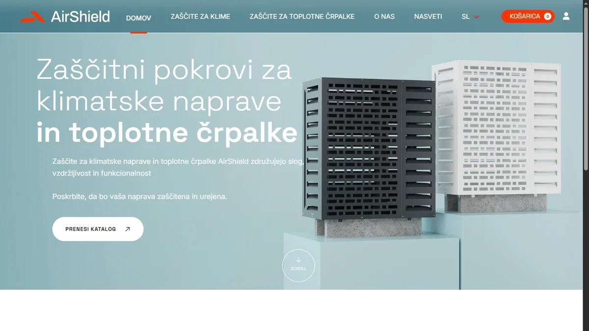
Seven hundred renders,
one single look
The challenge was never one render. The challenge was keeping seven hundred of them consistent.
6 models × 2 colours × 3 sizes · 700+ renders
Who AirShield are
InoCore of Sežana. Decorative protective covers for air conditioners and heat pumps, Italian design, the Blade and Provence models. Every piece is made to measure, in white or anthracite, matt or gloss. Delivery across the EU, sold through partners.
Simple enough on paper, and not in practice: six products, each in three sizes and two colours, each mountable on a wall or on the ground, and each needed in studio, technical and in-context versions. The startup had its own web team, so they needed only the visual part — but all of it, and within a month.
A model out of production data
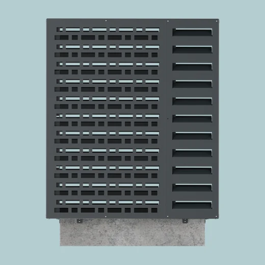
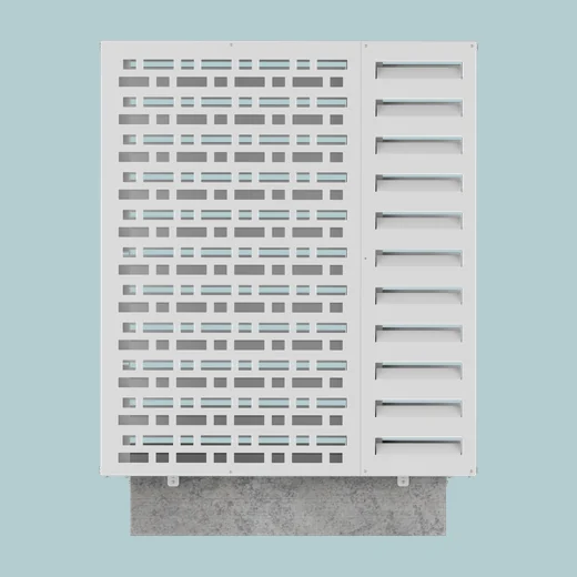
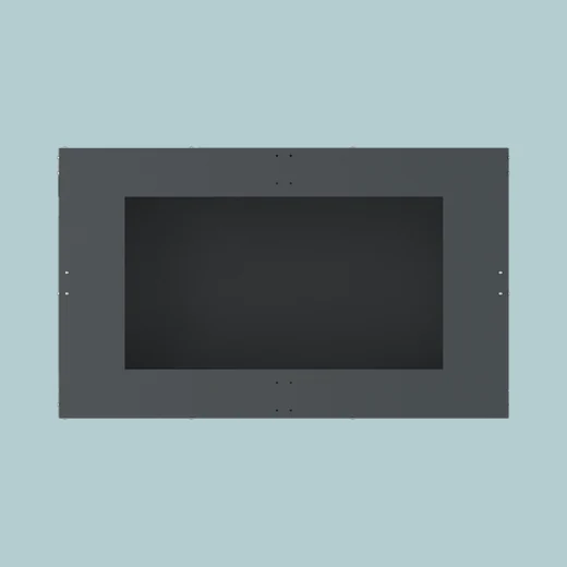
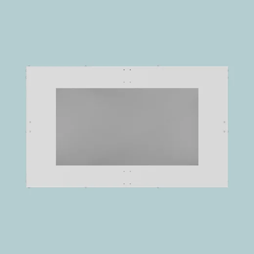
The client had CAD files made for manufacturing, not for rendering: too heavy, without clean topology and without materials. Every product was remodelled and textured so it could pass through an automated render pipeline. The same model then also yields the orthographic views for the data sheets — front, side, back and top — in both colours.
Orthographic views, both colours out of one model
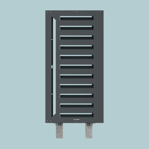
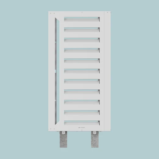
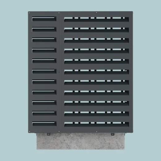
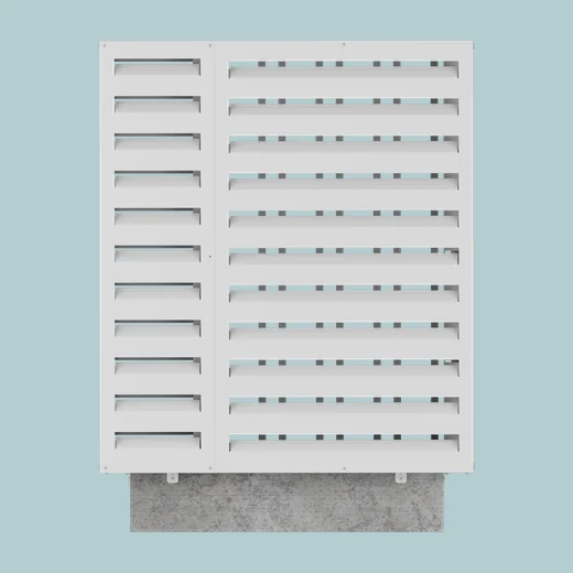
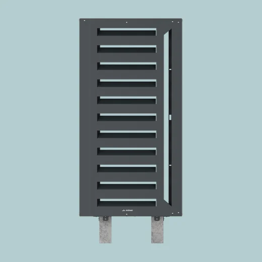
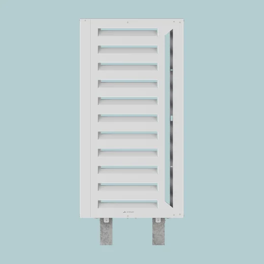
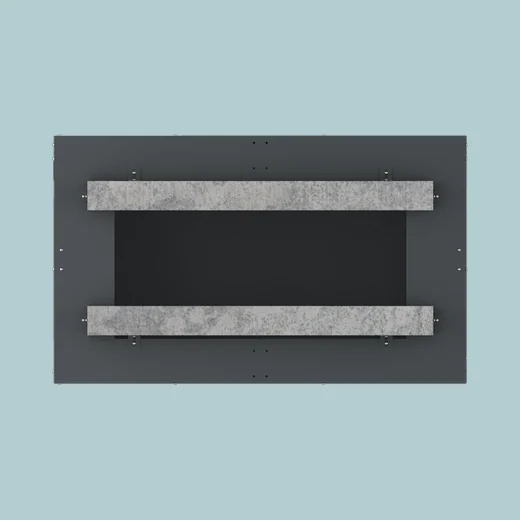
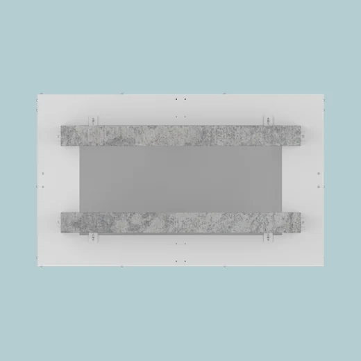
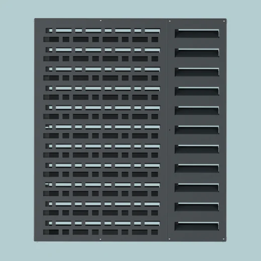
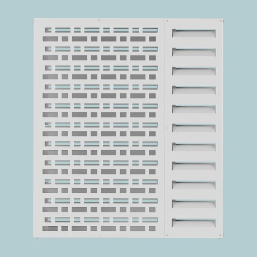
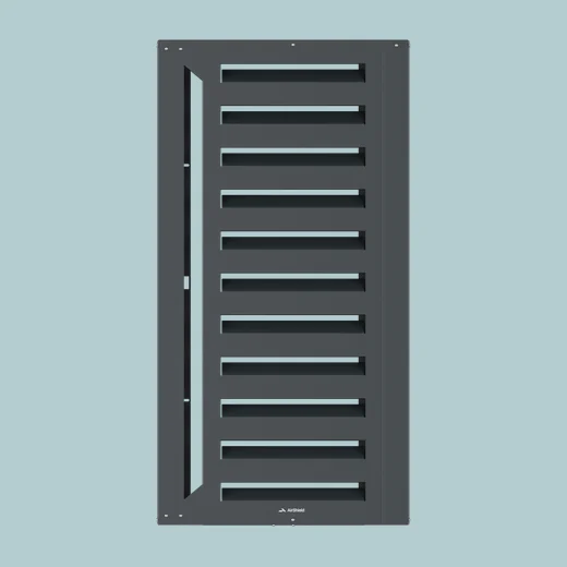
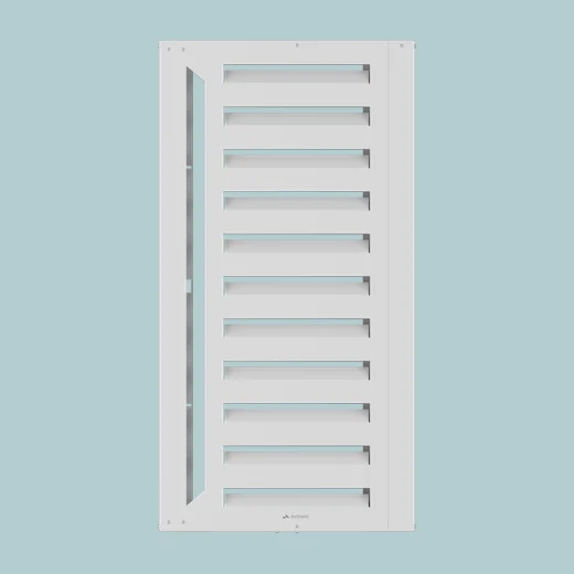
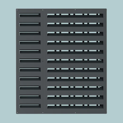
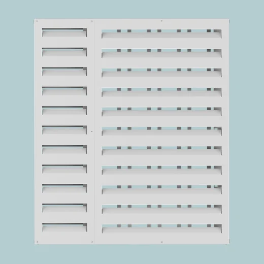
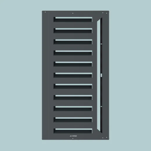
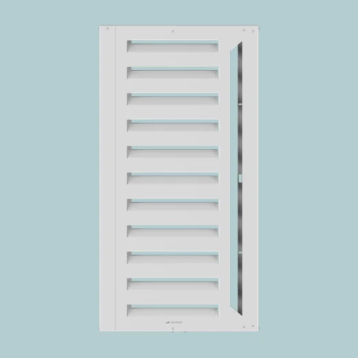
One look across the whole catalogue
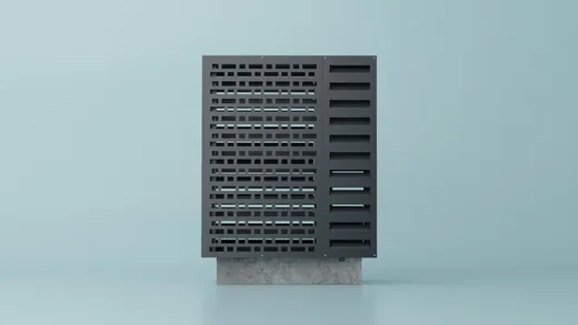
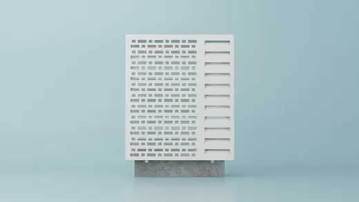
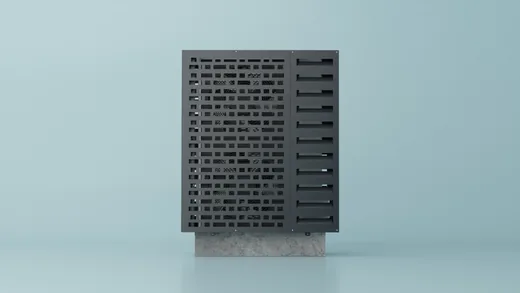
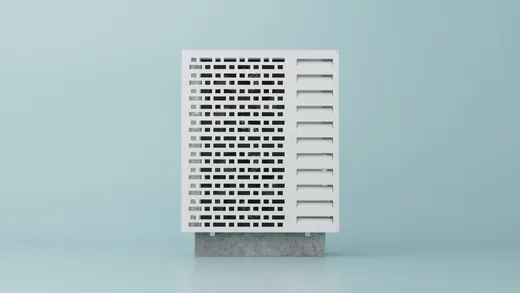
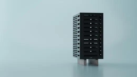
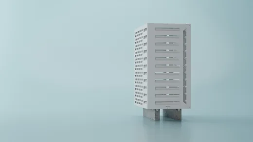
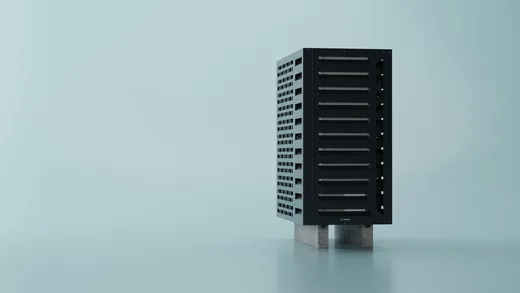
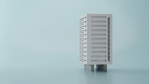
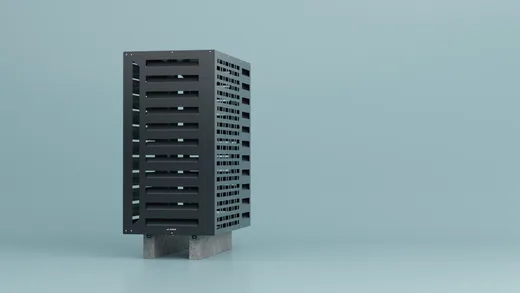
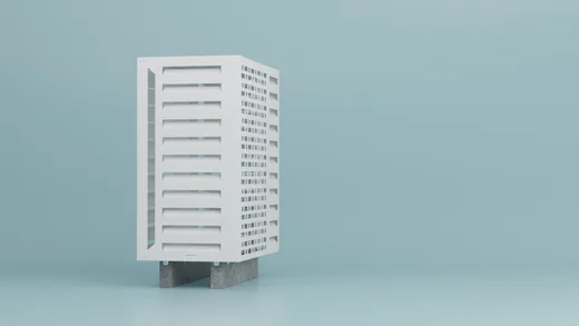
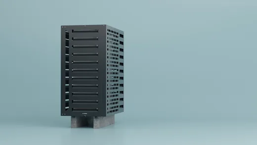
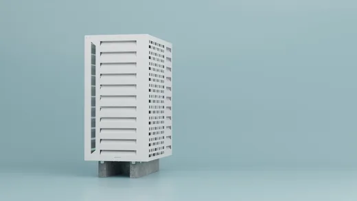
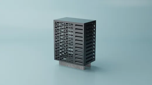
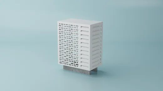
The set-up, the light and the framing are decided once, then every product in every colour and size passes through them. That is why the renders do not drift: the same light, the same tonal response, the same trace of shadow. At seven hundred images it is the only way the library reads as one day of photography rather than twenty different ones.
The studio set, every frame in both finishes

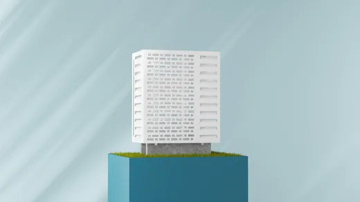
A scene for every use
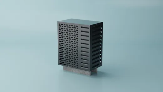
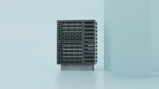
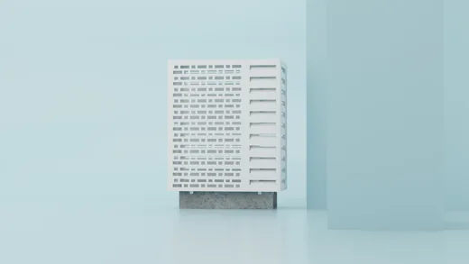
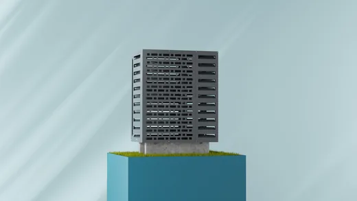
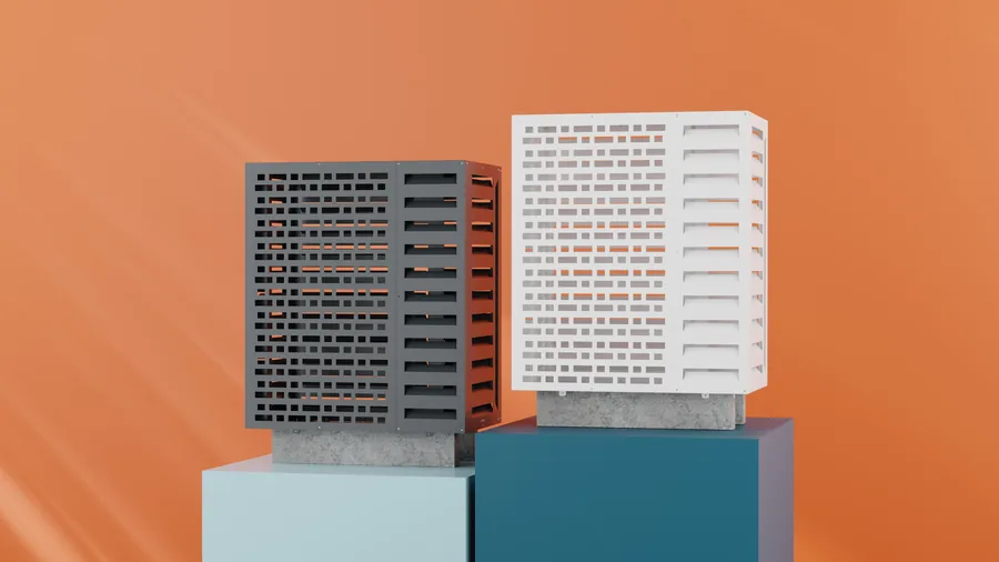
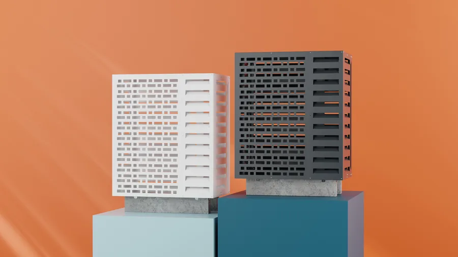
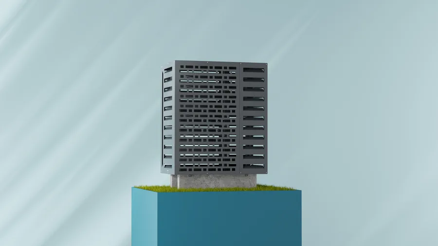
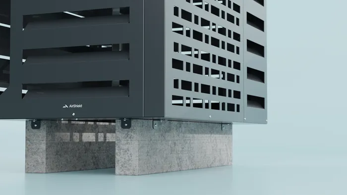
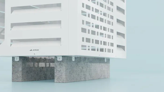
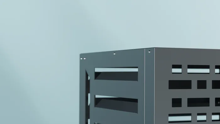
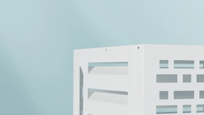
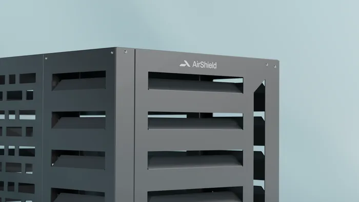
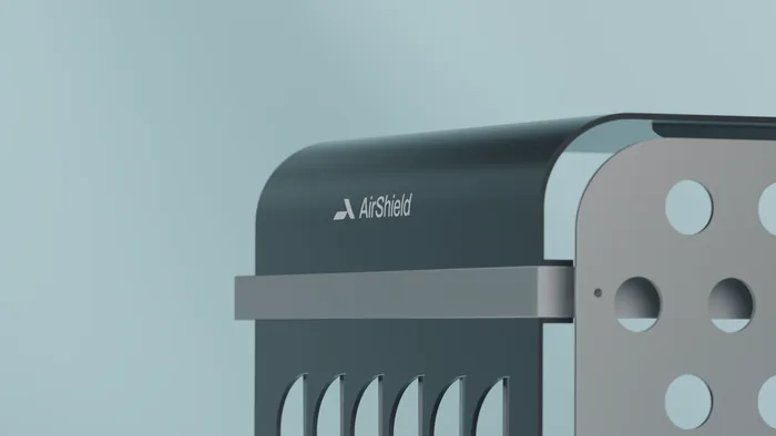
More than twenty scenes were built, each for its own purpose: arrangements on plinths for the website and social, pairs in both colours side by side for comparison, gobo lighting for a more advertising tone, and close-ups of the louvres, the mounts and the mark on the housing. All from the same models, so the product is the same product everywhere.
Arrangements for the web and for advertising
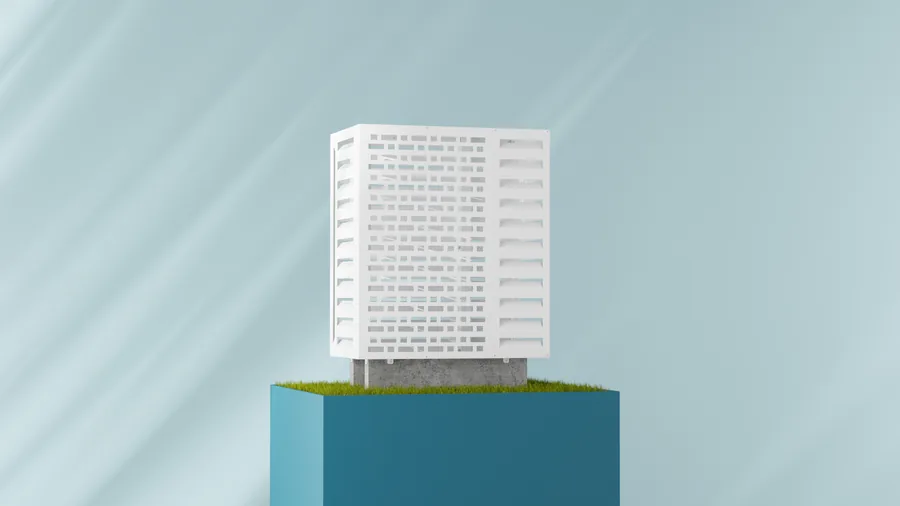
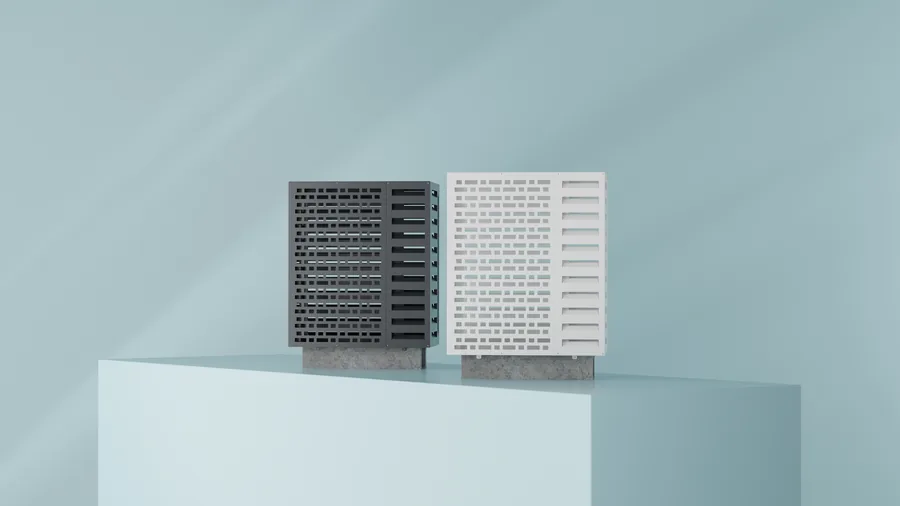
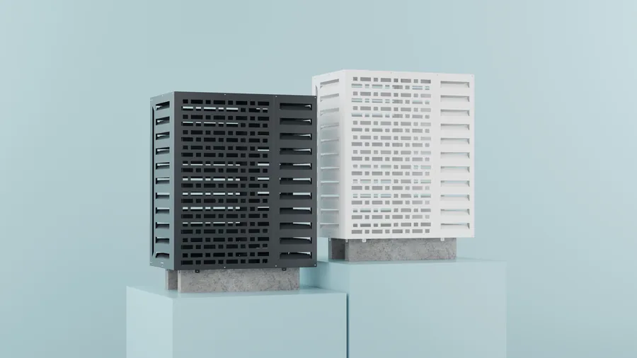
Close-ups
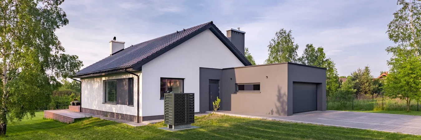
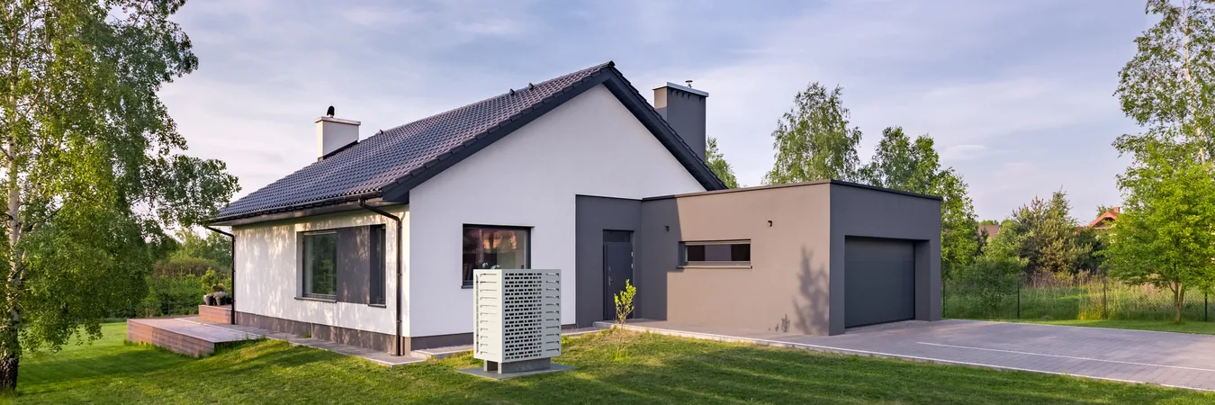
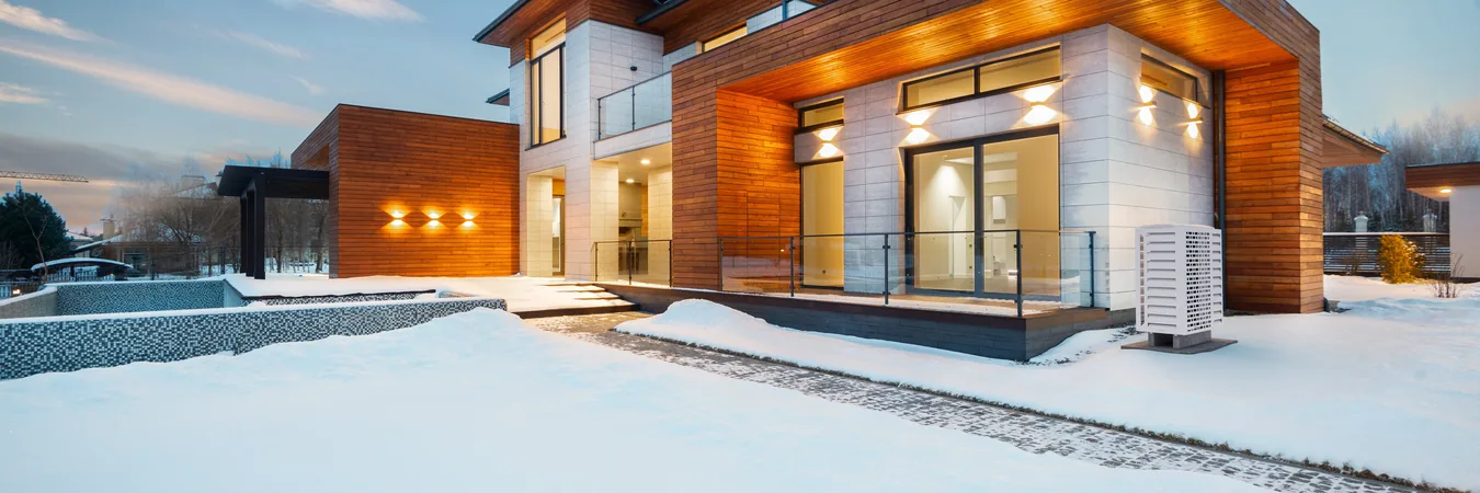
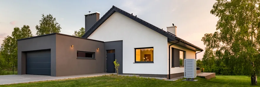
The product on a house, in both colours
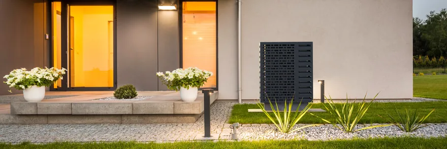
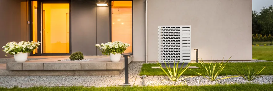
A buyer is not buying a cover, they are buying how their façade will look. So every setting is built twice: once with the white cover and once with the anthracite, on the same house, in the same light, from the same frame. Choosing a colour becomes a comparison of two images rather than a description.
The same house, the colour swapped
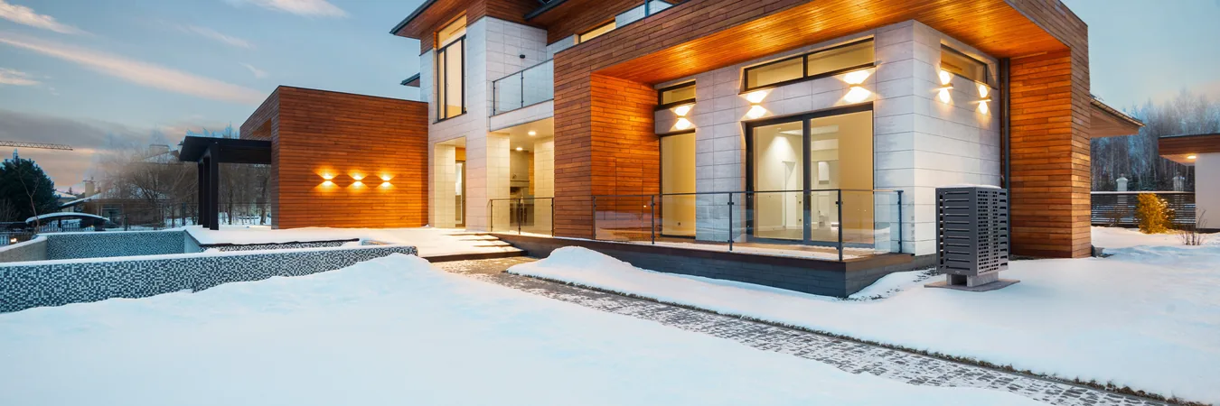
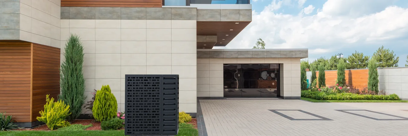
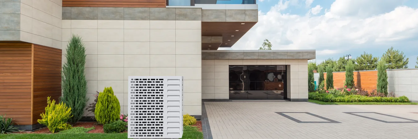
Two more settings, each as a pair
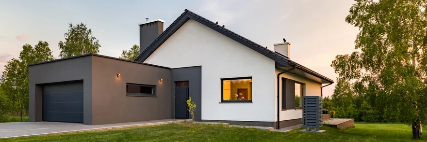
The brand in three dimensions
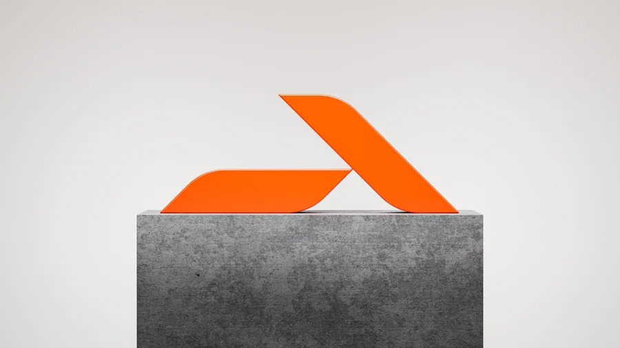
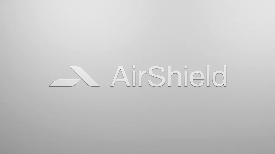
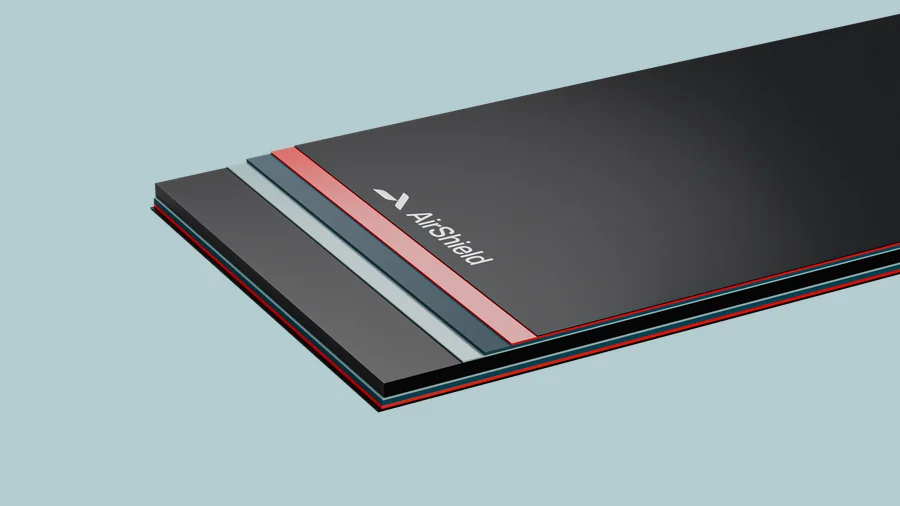
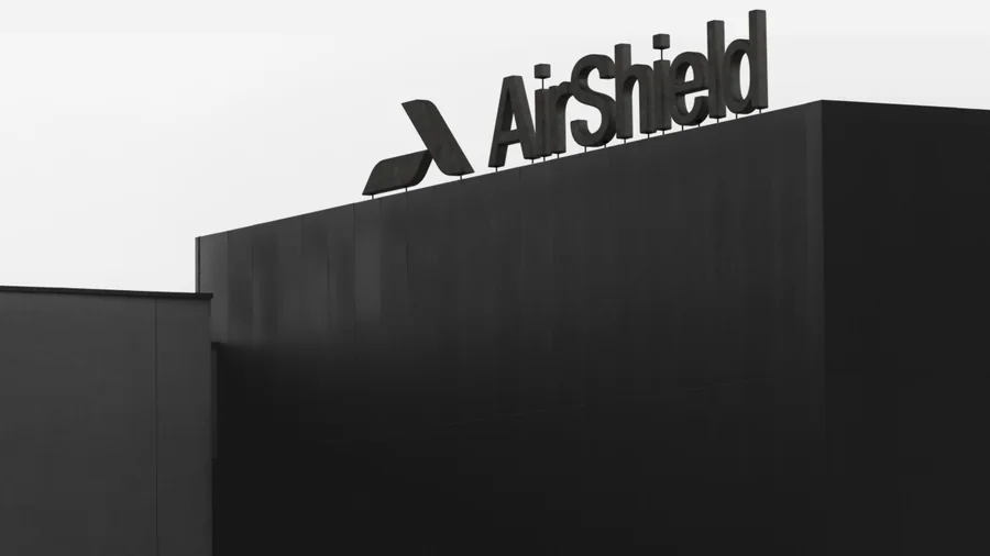
The brand was created by the agency MWEV Group; we rendered it: the mark as a cut piece on a concrete plinth, embossed into chrome, on the edge of stacked panels and as signage on the roof of a building. The same scenes as the product, only this time the subject is the logo.
Renders of the mark
Where the renders live
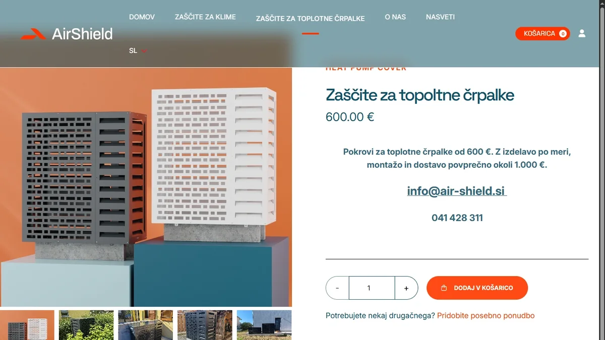
The online store was built by MWEV Group and Kabi, and the renders are everywhere in it: the home page, the product cards, the gallery on a product page and the before/after slider where a bare outdoor unit is replaced by a covered one. No photography had to be commissioned, because every frame needed already existed in the library.
Home page and product page